
CelDea


CelDea
CelDea Cosmetics is a beauty brand whose makeup will not only look beautiful but also nourish your skin. Cel from CelDea comes from the word celeste meaning heavenly and Dea stands for goddess. CelDea wants others to reflect their inner goddess. Turn even the simplest look into a statement. CelDea Offers cosmetics made from high-performing natural formulas that are free of synthetics, silicones, and parabens; creating products that are not only non-toxic but also cruelty-free.
The label’s makeup and skincare ranges feature raw, food-grade and organic ingredients that promote anti-aging and long-lasting beauty. Many people have absolutely no idea what the ingredients list even is, how it works, and what the products do. Some are preservatives, some pigments, some binding agents, some fillers. With CelDea you will find that this brand cares about its ingredients in products and you. The focus is on everyday suburban women who are 26-30 and are of working-class that can afford a little more for the sake of their skin.
Sketches
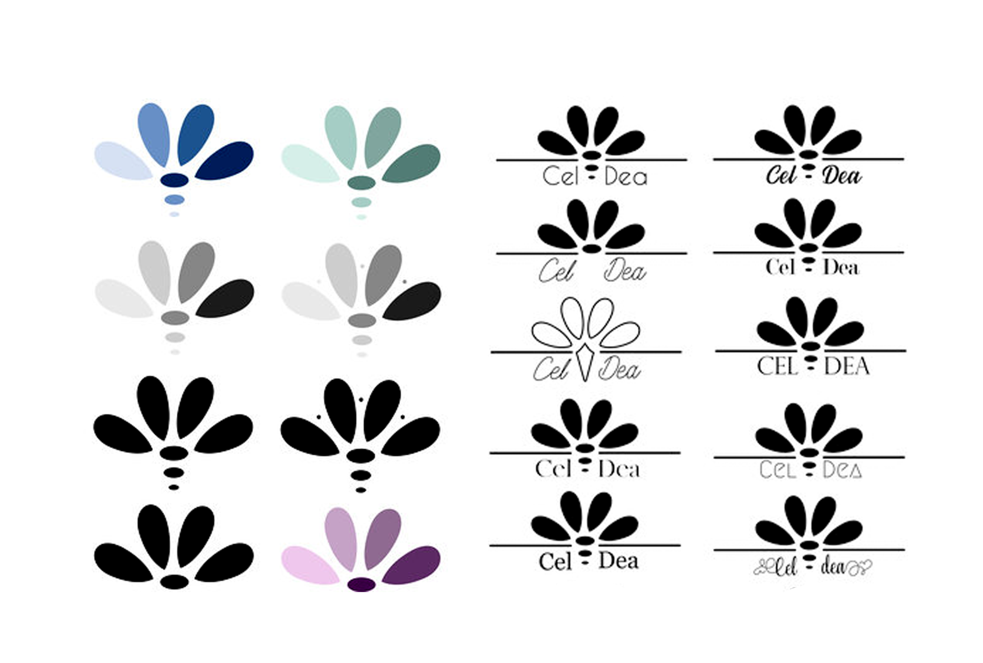
Throughout these sketches, I really had my mindset on something floral and elegant. These sketches were the options I was drawn to because of the simple stacked layout and the icon that looks like a flower with different colored petals to represent diversity. The logo was either going to be a shape or a floral object.

Concepts
These are the different design concepts and colors that I worked through considering. Below is a photograph where I found inspiration for my color palette. I wanted something fresh and organic. I liked the naturally high contrasted colors from food.


Clearance &
Alternative Layouts


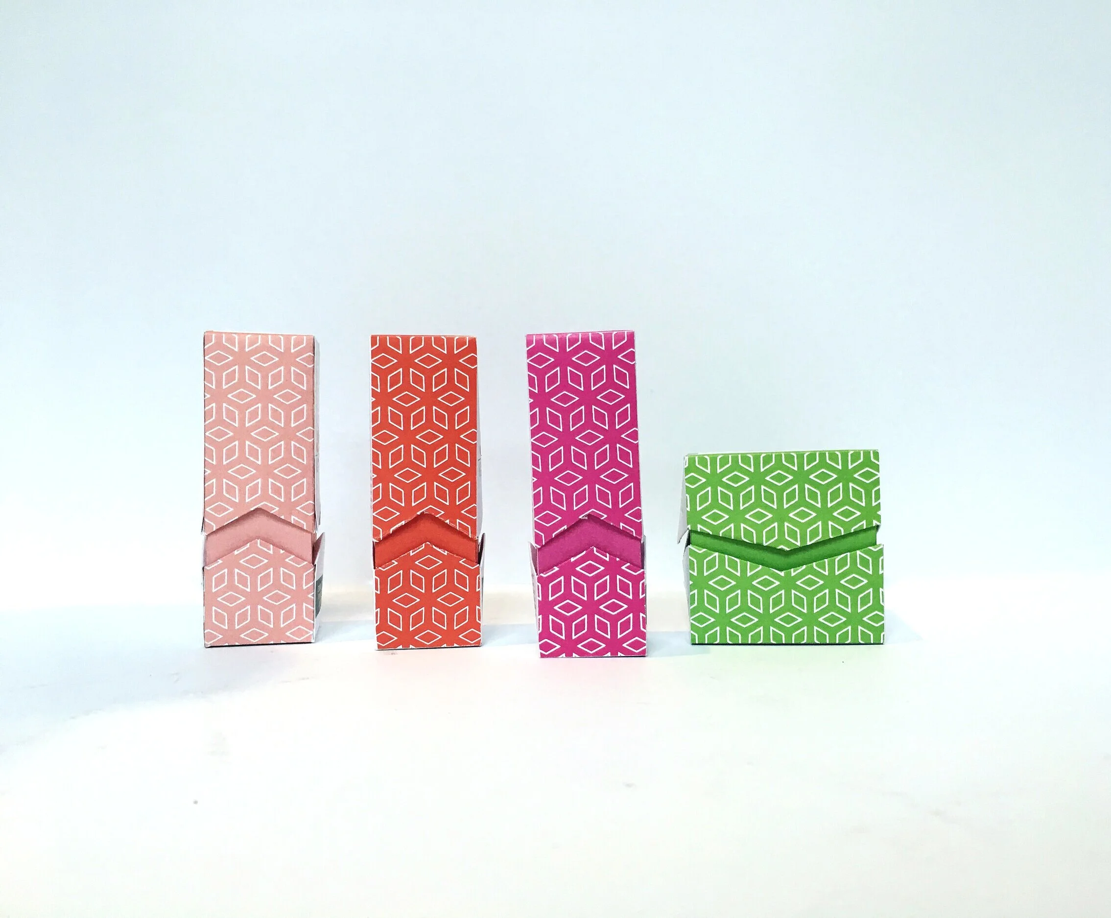
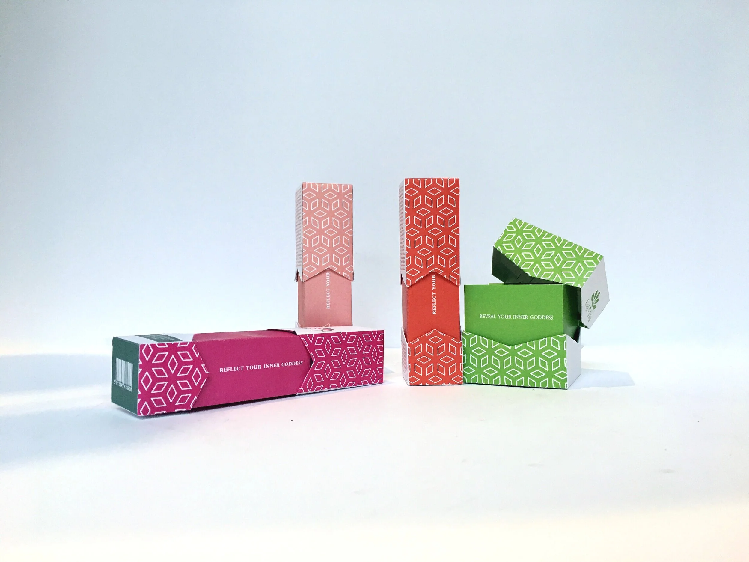
Packaging
Makeup is all about color. I have to be careful not to pick anything that is not represented in nature because this brand is all about using organic ingredients and nothing harmful to the skin. It needs to be practical and beautiful. Cosmetics can get away with looking a little abstract as long as there is a clear typeset that is bold enough or at least legible to read what the product is inside as well as ingredients. The cut out having the empty space is great to show the color of the lipstick. The only difficulty was working in such a narrow space.